Turning Letters into Colors to Create a Visual Language

Color surrounds us daily, influencing emotions, guiding our decisions, and shaping the way we interpret the world. Colors can signal warnings—like yellow caution signs or red stop lights—and even represent deep cultural meanings. However, the meanings we assign to color often differ dramatically from one culture to another. What if color could transcend these cultural differences and serve as a universal form of communication?
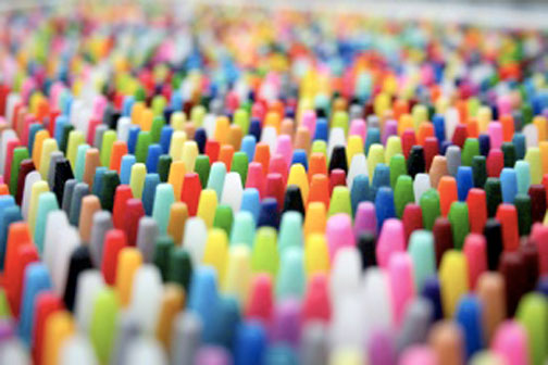
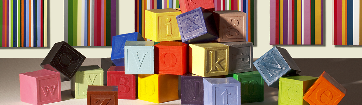
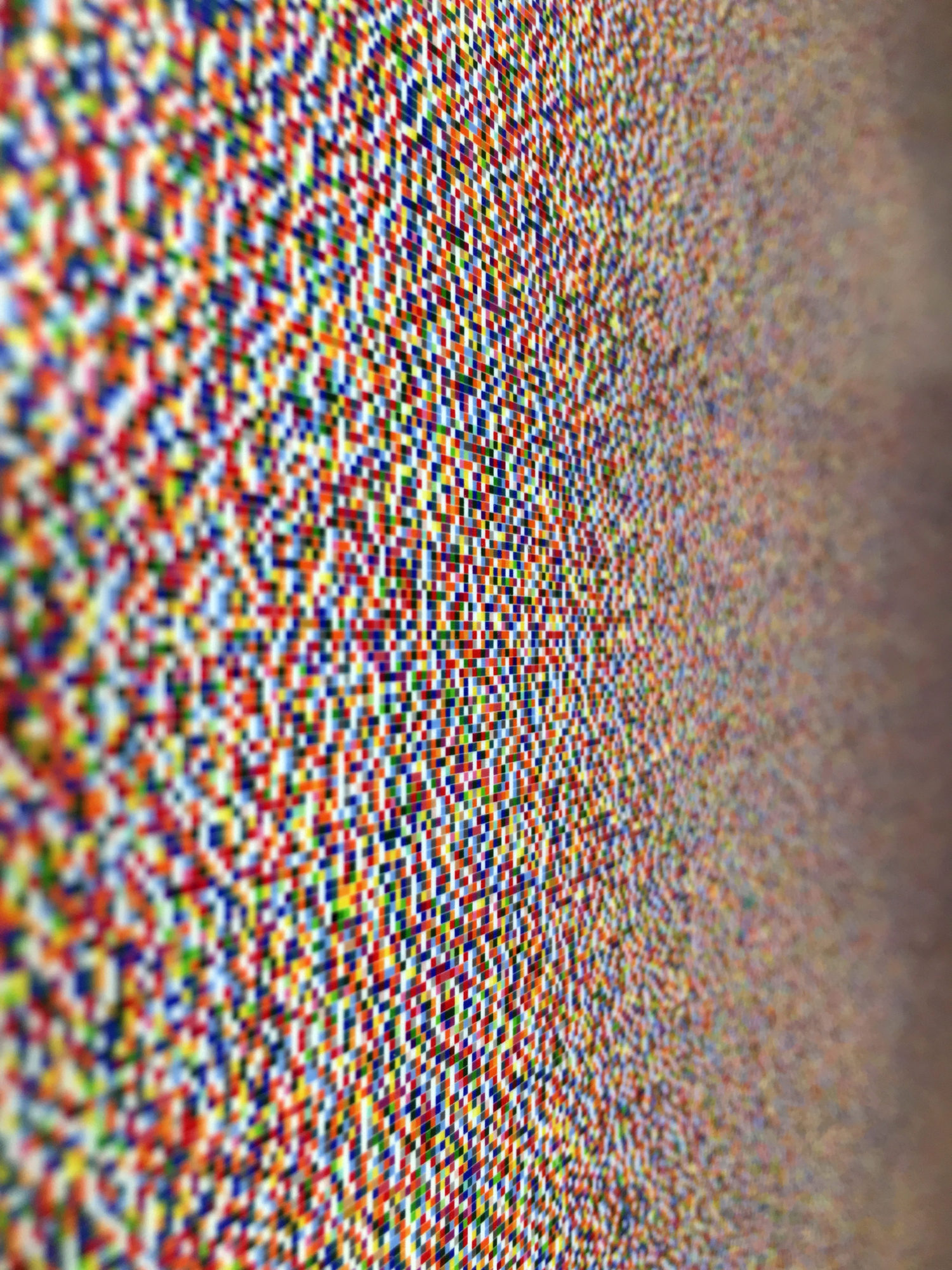
Hand cast encaustic crayons
12 in x 12 in.
That idea inspired me to create the Color Alphabet.
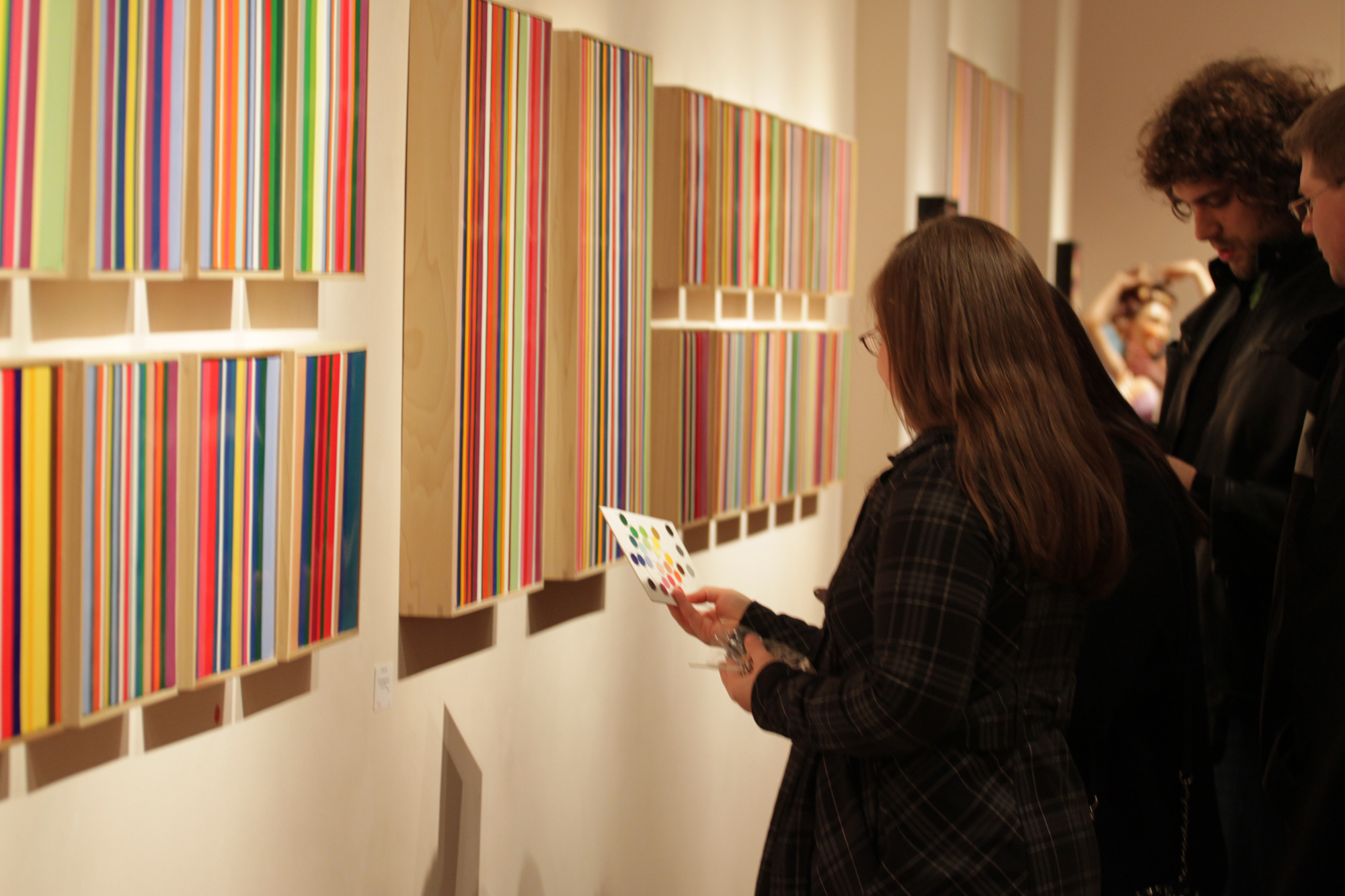
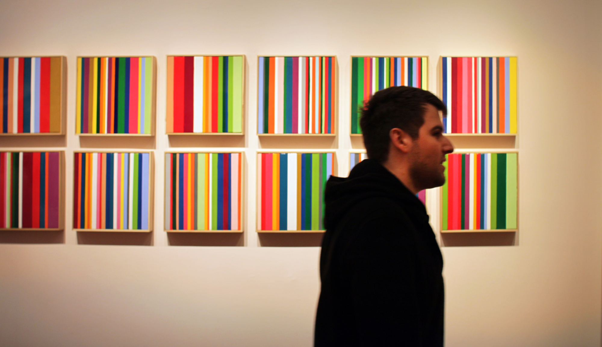
As an artist, I constantly explore ways to embed meaning in my work. My journey began with a search for a universal way to communicate through color—something that wouldn’t lose its meaning from one culture to another. Realizing the difficulty in creating entirely new meanings for colors, I instead chose to map colors directly to something familiar: the English alphabet. The alphabet is a universal system that we already understand. By pairing each letter with a distinct color, I created a way for text to become a visual experience.
Historical Inspirations and Modern Examples
Throughout history, people have used color symbolically to represent clans, flags, military units, and even complex messages. The ancient Incas, for example, communicated through colored strings and knots known as Quipu, effectively turning color into language.
In modern life, colors help engineers read resistor values and wire codes, and marketers use them to evoke brand recognition instantly. This inspired me to create a practical yet artistic system of encoding language directly into color.
Selecting the Colors: A Visual and Practical Approach

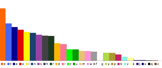
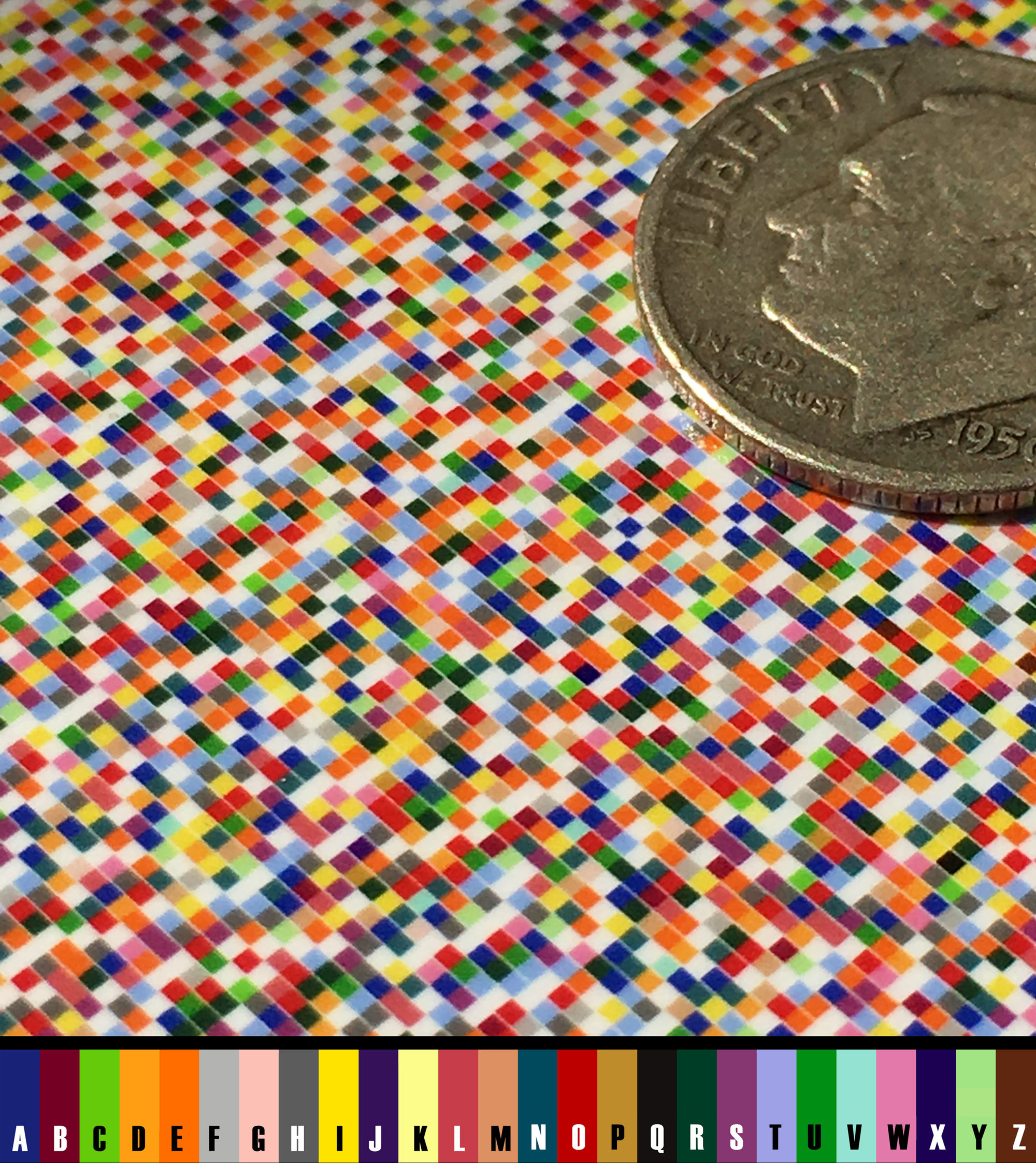
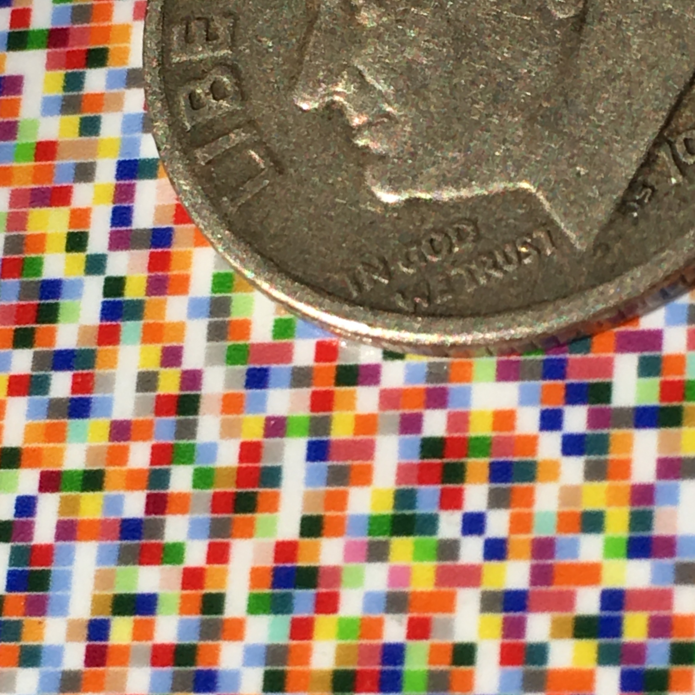
Choosing 26 distinct colors wasn’t straightforward. Human eyes can distinguish millions of colors when placed side-by-side but struggle to recall specific colors accurately over time. Research shows that most languages use only 12 fundamental color terms consistently recognized by everyone—colors like red, blue, green, and yellow.
To design the Color Alphabet, I began with these 12 universally recognized colors. I removed white to use as the background, leaving 11 colors. Then, guided by how often letters appear in English (letter frequency), I assigned the most common vowels (A, E, I, O, U) the brightest, most vivid colors to ensure quick recognition:
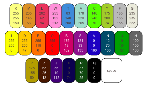
A: Blue
E: Orange
I: Yellow
O: Red
U: Green
Next, frequently used consonants received easily distinguishable secondary colors. Finally, the remaining letters were assigned carefully varied shades and hues to ensure each letter remained distinct and identifiable.
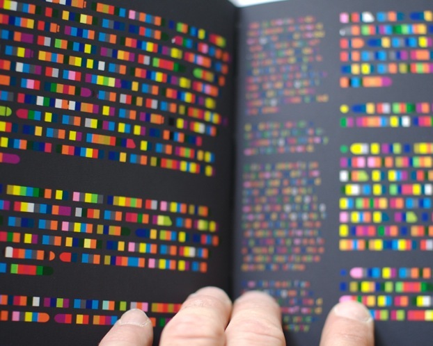
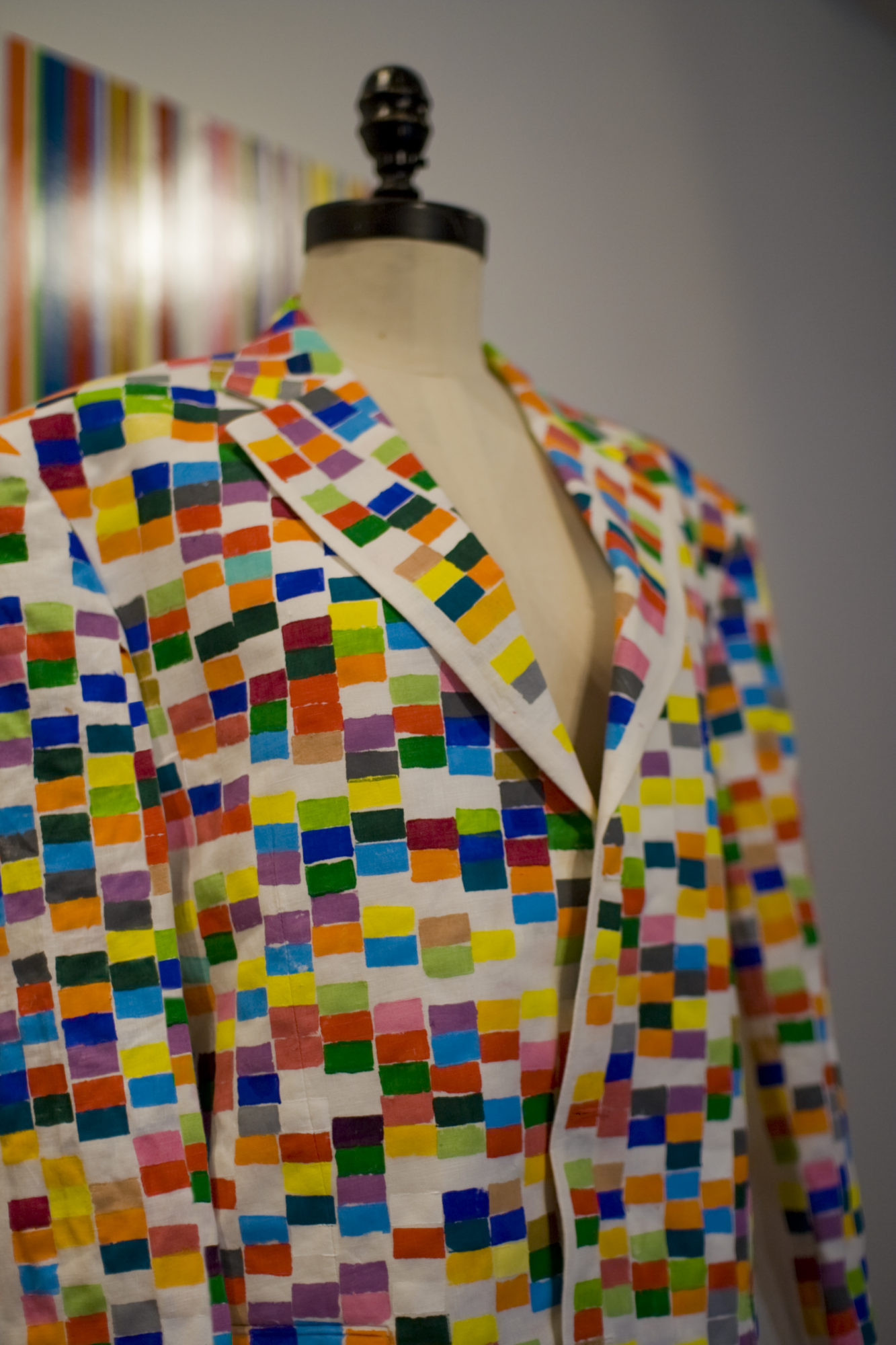
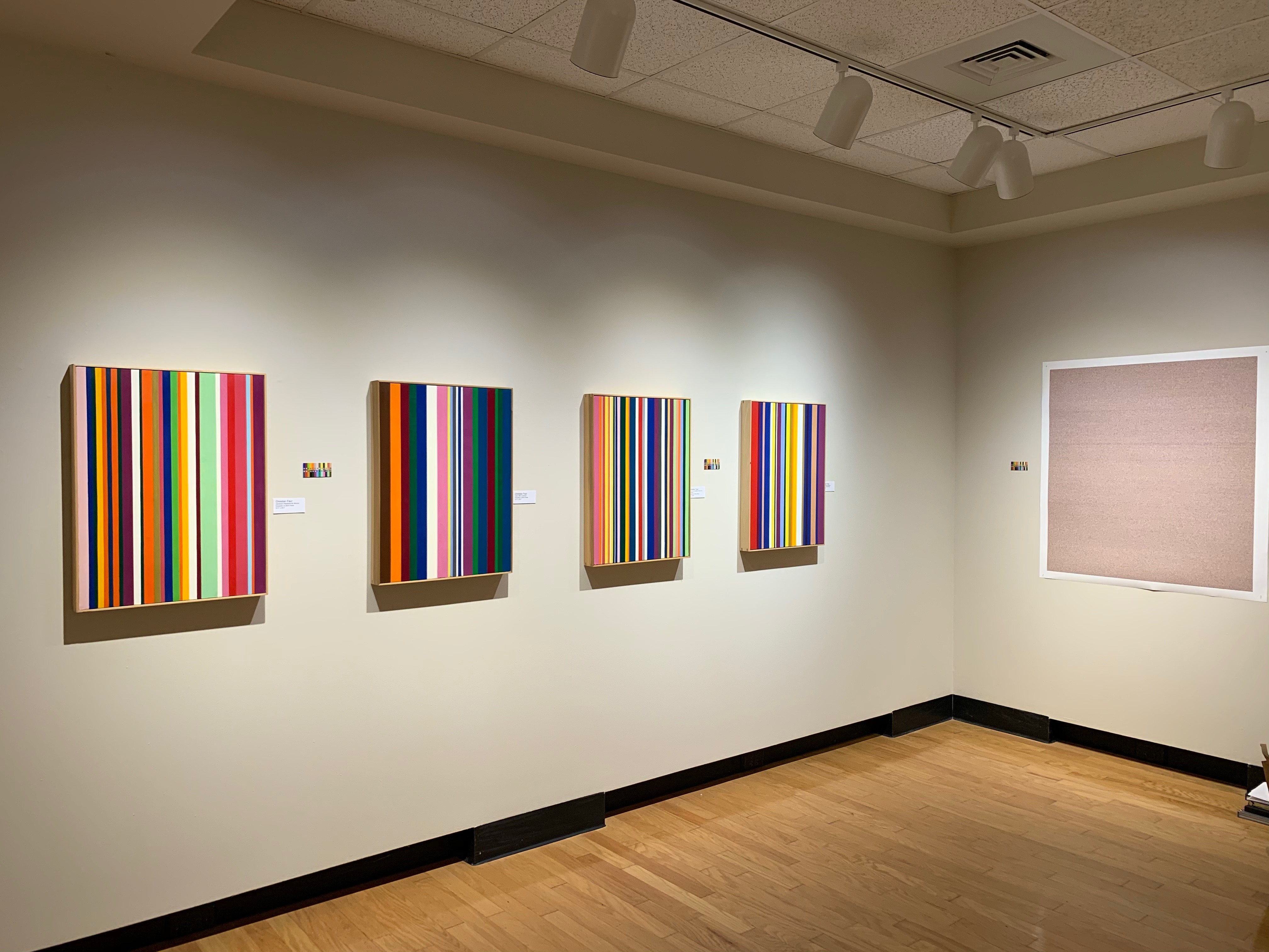
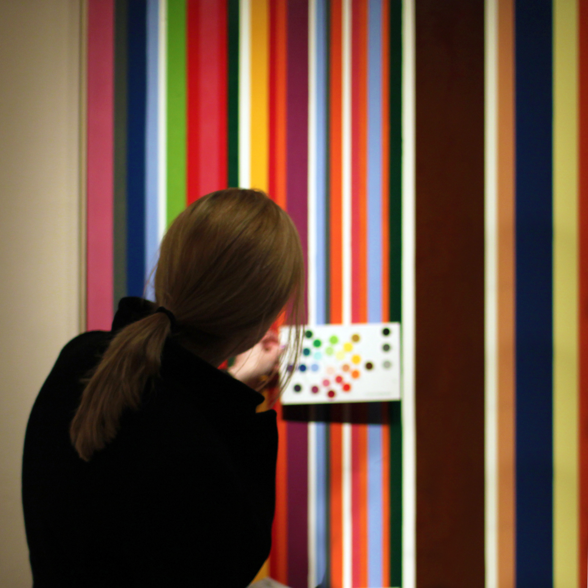
The Font: Specially Designed Glyphs
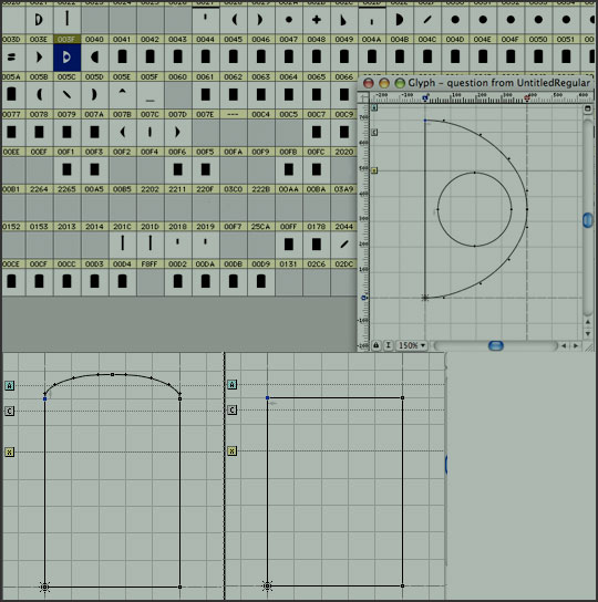
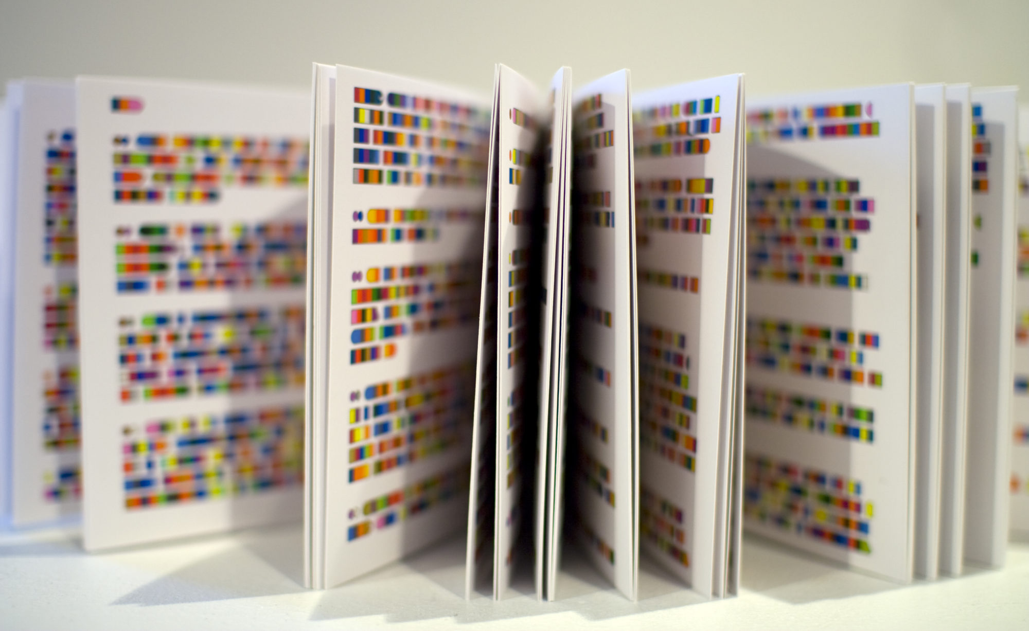
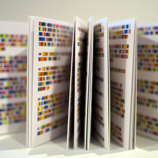
Standard fonts didn’t fully support this new visual language, so I designed special glyphs—simple vertical rectangles—to carry the colors. Capital letters gained curves at the top, making them visually unique yet still easy to recognize. Custom punctuation symbols clearly mark sentence beginnings and endings, helping readers quickly understand the flow and rhythm of the text (seen below top row: period, ? ! and , )
This carefully crafted font makes reading color text more intuitive, even at higher densities.

Can We Really Read Color as Easily as Text?
Initially, reading colored text might feel unfamiliar. Traditional reading relies on word shapes and letter spacing. But current research indicates we actually decode letters individually, relying heavily on familiarity and context. This means with practice and good lighting, reading the Color Alphabet could become as natural as reading conventional text.
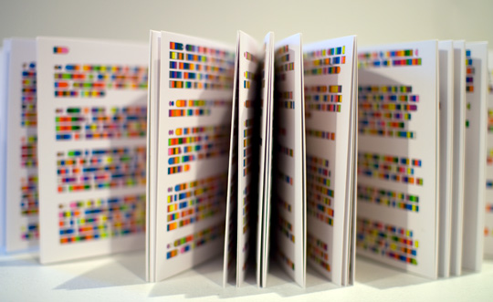
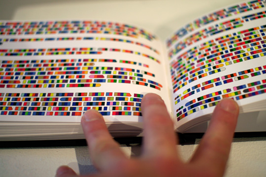
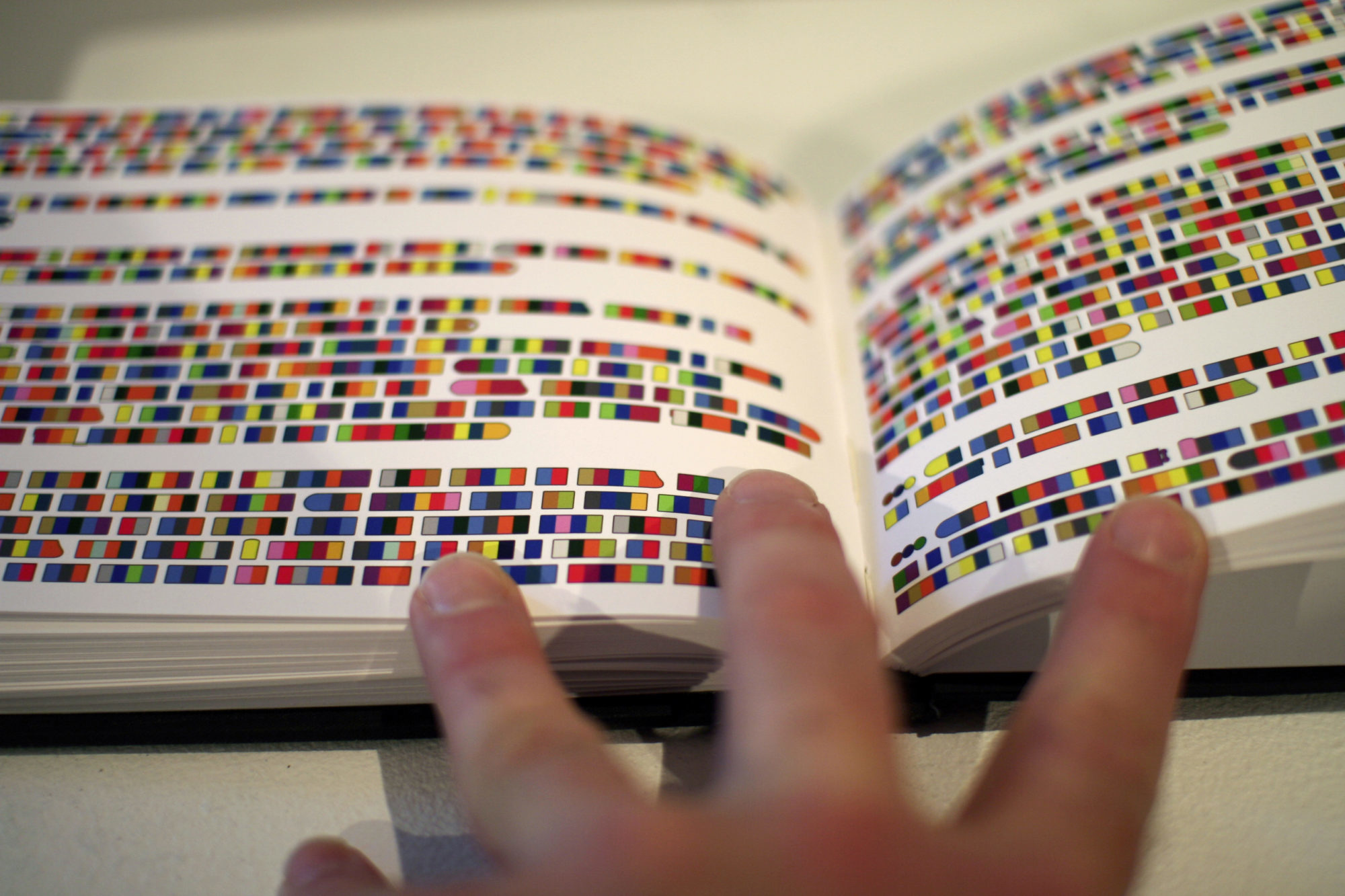
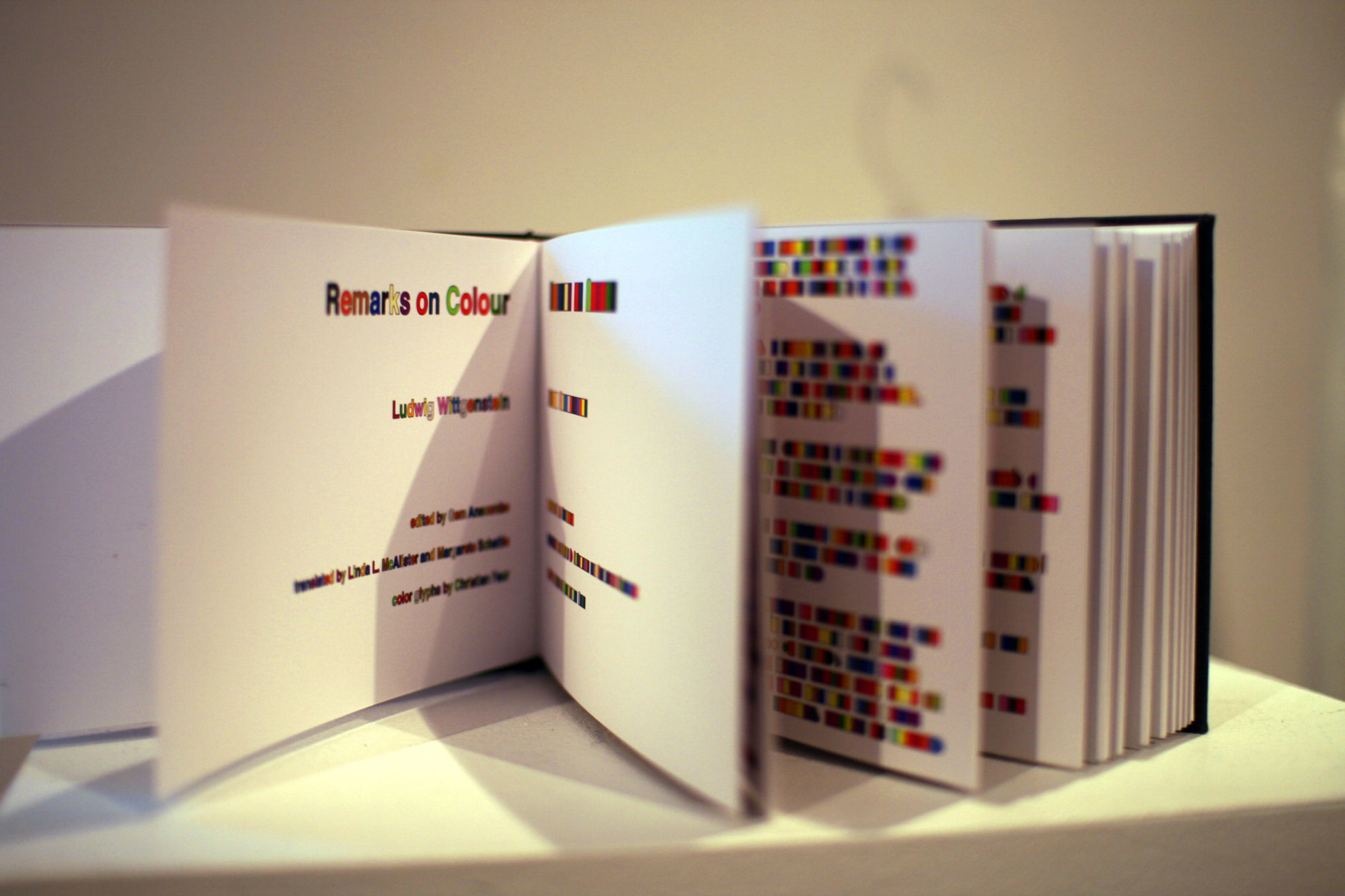
(Below original handmade artist book based on the text “Remarks on Color*” by Ludwig Wittgenstein)
*Wittgenstein, Ludwig. Remarks on Colour, Trans. Linda L. McAlister, Margarete Schättle. Berkeley: University of California Press, 1977.
https://www.christianfaur.com/fiber/remarksOnColour/remarksOnColour_Ex.pdf
Challenges with a Color-Based Language
Of course, there are practical considerations:
• About 10% of males (and a small percentage of females) experience color blindness.
• Colors often appear different based on surrounding colors, lighting conditions, or fading pigments over time.
• Color memory isn’t as strong as shape or symbol recognition.
• It takes practice to “read” fluently in color.
• Accurate color reproduction remains a challenge for many devices.
Despite these challenges, the Color Alphabet offers a fascinating, engaging way to merge visual art and written language.
Explore and Experiment
Interested in trying it yourself? Explore the links below to download the Color Alphabet font or convert your text directly into color:
• Convert Your Own Text into Color
